



Best web design for Chattanooga boat charters: what a booking-ready site needs
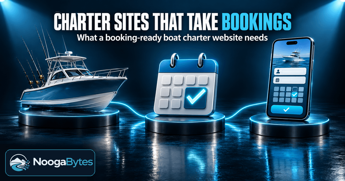
Web design for Chattanooga boat charters should help a guest understand the trip, trust the operator, and book without a phone call. The site needs to work just as clearly on a phone as it does on a desktop.
Key takeaways
- Organize the site around the actual trips offered, with clear paths from the main menu.
- Give each trip a useful description, including capacity, duration, meeting location, and policies.
- Choose booking software that keeps availability and reservations consistent across channels.
- Test the complete booking process on phones and tablets, including forms, payments, and confirmations.
- Use accurate trip names and contact details on the website, local listings, and booking services.
- For a real example of charter-site organization, read the Molly’s Boats website redesign case study. Compare the Professional Audit, Website Tune-Up, and Website Rebuild by scope, and use the pricing page for current rates.
Organize the site around real trips and launch points
A guest should be able to tell which trip fits the day they have in mind without sorting through a generic list of services. Give each genuinely different trip type a clear route from the main navigation, then describe the differences in plain language.
For example, if trips vary by length, activity, or departure location, make those differences visible in the page names and descriptions. A visitor should not have to open several nearly identical pages to work out which option is right.
Create a service-area or launch-point page when it gives customers useful, distinct information: where to meet, how to get there, what to expect at that location, or which trips leave from it. Avoid pages that only swap one place name for another. Repeated pages with no useful local details make it harder for guests to choose.
Keep the next step obvious. Use direct calls to action such as Book a trip or Ask a question, and place them where visitors can find them on both desktop and mobile. A booking button buried in a menu costs the guest time at the moment they are ready to act.
Answer the questions customers have before booking
Each trip page should answer the practical questions a guest needs resolved before paying. State the capacity, duration, what is included, where to meet, and the weather and cancellation policies.
These details let customers judge whether the trip works for their group and schedule. Meeting instructions should identify a clear location and explain what guests need to do when they arrive. Keep policy language direct, so guests know what happens if plans change.
Use authentic charter photography to show the boat, the setting, and the experience guests are booking. Consistent colors, type, and image treatment help the site feel like one business rather than a collection of unrelated pages.
Large photos can slow a page, especially on a mobile connection. Resize images for the space they occupy, compress them before uploading, and load images lower on the page only as visitors reach them. Keep the most useful trip image clear and quick to see.
The Molly’s Boats redesign is a useful example of organizing information for a charter business. Molly’s Boats serves San Francisco Bay, not Chattanooga, and the case study describes separate trip pages, online booking and payment, online waivers, gift certificates, an FAQ, and seven blog guides.
The project shows how trip information and the reservation path can work together, rather than sending every guest to the phone.
Choose booking tools that stay in sync
Choose booking software based on how your trips are scheduled and paid for. Check that it can represent the details that matter to your operation, such as trip options, available dates, guest counts, payment steps, and the confirmation guests receive.
Connect the booking calendar to the website and the other channels where you accept reservations. If one calendar shows a date as available after another channel has booked it, you create avoidable confusion for the guest and extra work for yourself.
Make the booking action prominent on every trip page. Keep the path from choosing a date to payment and confirmation as short and clear as the software allows. Explain any required information as the guest moves through the steps, rather than surprising them at checkout.
Before launch, complete a real test booking from start to finish. Check calendar availability, forms, payment steps, and the confirmation message on both desktop and mobile. Then review where visitors leave the process; a repeated exit at the same step can point to confusing wording, an unexpected requirement, or a technical problem.
Do not test only the easiest route. Try a date that is unavailable, a form with a required field left blank, and a booking that reaches confirmation. Each test checks a different part of the reservation experience.
Make mobile access, accessibility, and speed part of the design
Guests often browse between other plans, so responsive design must support the whole booking process, not just a homepage that shrinks to fit a screen. Make menus, date pickers, form fields, and booking buttons large enough to tap comfortably.
Test the complete flow on phones and tablets. Check that the guest can read trip details, choose a date, enter information, pay, and understand the confirmation without switching to a desktop.
Accessibility also depends on details that are easy to miss in a visual review. Use readable contrast between text and its background, show a clear focus indicator when someone navigates with a keyboard, and make sure forms and menus work without a mouse.
For a site that needs a new structure, responsive design, and page development, a Website Rebuild can put the content and measurement tools in place alongside the new pages. Optional Hosting + Care is available for ongoing support.
Speed belongs in the same review. Compress photos, avoid oversized decorative elements, and make sure important trip details appear without unnecessary delays. A slow page can frustrate a guest before they reach the information that would help them book.
Make local discovery and charter details consistent
Use natural place names in page titles and trip descriptions, and state the actual service area and launch point clearly. A customer should be able to tell where a trip departs before opening the booking calendar.
Keep trip names, descriptions, contact details, and booking links consistent across the website, local listings, and any third-party booking service. When a departure point or trip name differs between places, guests may wonder whether they have found the right operator or option.
Maintain the same core details wherever customers encounter the business. When an offer, meeting instruction, or contact number changes, update the website and other listings together.
Measure inquiries and completed bookings alongside visits to the site. The number of page views alone does not tell you whether guests found the right trip, finished a reservation, or contacted you for help.
Choose between an audit, a tune-up, and a rebuild
Match the work to the problem. If it is not clear why the current site is underperforming, begin with an audit of its performance, mobile experience, and technical foundations. That gives you a defined set of issues to address before you commit to a larger change.
A tune-up fits when the existing site should stay in place but needs specific performance, mobile, or configuration fixes. It preserves the current site and focuses the work on problems that are getting in the way.
A rebuild makes sense when the site needs a new structure and responsive design, not a short list of isolated repairs. It includes page development, content, and measurement tools in place, with optional Hosting + Care available.
| Choose this | When it fits | What it addresses |
|---|---|---|
| Professional Audit | The needed changes are unclear. | Website performance, mobile experience, and technical foundations. |
| Website Tune-Up | The current site can remain in place. | Performance, mobile, and configuration issues. |
| Website Rebuild | The site needs a new structure. | Responsive design, page development, content, and measurement tools. |
The pricing page linked above shows current prices and the difference between founder and standard rates. Start with the audit when you need a clear diagnosis; choose the scope once you know what the site needs to do.
Frequently asked questions
How long does it take to build or redesign a fishing charter website?
The schedule depends on the number of trip pages, the booking setup, and how quickly the operator can provide accurate details and photography. A site with a defined scope and ready-to-use content can move through design and review more directly than one still deciding what each trip includes.
Do I need a separate website to sell branded apparel for my charter business?
A small apparel range can sit alongside the charter information on the same site if the store experience and fulfillment remain straightforward for the operator.
Should my charter website use a domain name that includes Chattanooga?
No. A clear, memorable business name can work without a city in the domain, while the site itself explains the service area and departure points. Choose a domain guests can recognize and remember when they want to return to the booking page.
How should a charter website explain what happens when weather affects a booked trip?
State who makes the weather decision, when the guest will hear from the operator, and how the operator will contact them. Explain the available choices for rescheduling or refunds, including how any payment already made is handled.
Conclusion
Web design for Chattanooga boat charters works when guests can compare real trips, understand the meeting details and policies, and complete a booking on the device they have with them. Keep the calendar, contact information, and trip descriptions consistent wherever customers find the business.
If you are unsure what needs to change, start with an audit. Then choose a tune-up or rebuild based on the actual problems, not on a generic template or a guess.